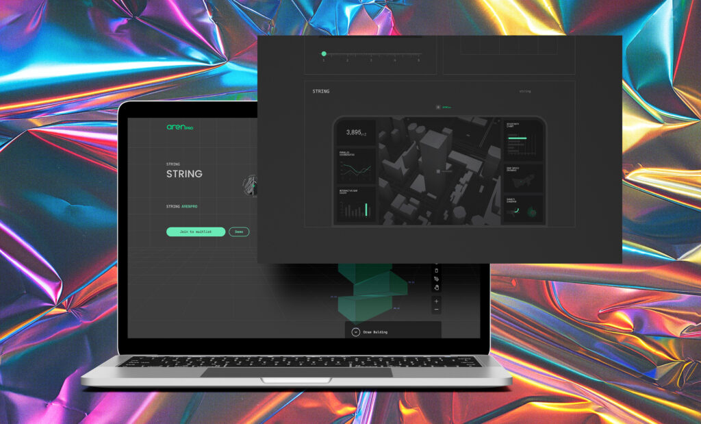
Modern and Futuristic Landing Page Design for arenpro.com
Info
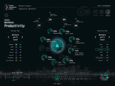
The landing page design for arenpro.com is sleek, modern, and futuristic. We have utilized a dark color scheme with accents of blue and green to create a visually stunning experience reminiscent of HUD graphics.
<Let’s Talk 🤙🏽>
 Scroll Down
 Client : Roya Rezaei
Design : Pedram Moghadam, Farzad Kafaei
<Open Website 🔗 >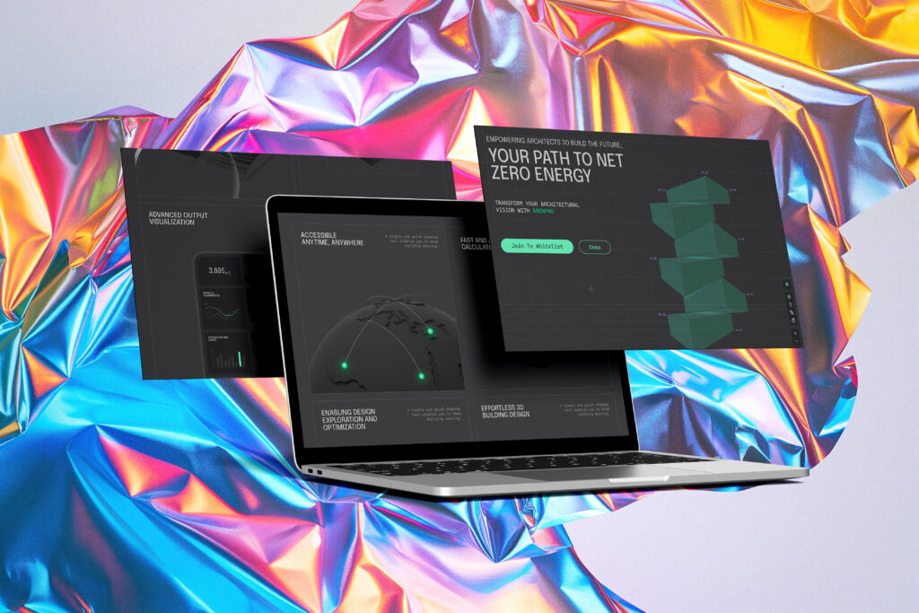
The landing page design for arenpro.com is sleek, modern, and futuristic. We have utilized a dark color scheme with accents of blue and green to create a visually stunning experience reminiscent of HUD graphics. The combination of dark and bright colors gives the landing page a high-tech and cutting-edge feel, perfectly reflecting the innovative nature of our online platform.
The layout of the landing page is clean and intuitive, guiding visitors through key information about our services and offerings. The use of bold typography and striking visuals helps to grab the attention of users and keep them engaged as they explore the site.
One of the main goals of the landing page design was to bring the essence of our online platform to life. By incorporating elements of technology and modernity, we aimed to create a seamless transition from the landing page to the full website experience. This cohesive design approach ensures that visitors feel immersed in the world of arenpro.com from the moment they arrive on the site.
Overall, the landing page design for arenpro.com is a visually captivating and user-friendly introduction to our online platform. With its dark color scheme, futuristic elements, and intuitive layout, the landing page sets the stage for an engaging and memorable user experience.
